Building a memorable Las Vegas logo design that resonates with your audience and helps you to build loyalty is no easy task. A logo is a super important visual component that will help your brand win the admiration of loyal fans and followers.
A logo design should be crafted so that it illustrates your brand beliefs, functions and values – this should all be fairly easy to realize with one quick glance.
Below are five basic logo design formats with simple explanations to help you to think, plan and formulate your logo strategy with ease.
Logo icons and symbols
A logo icon or logo symbol offers a representation of your business in an abstract or stylized manner that is designed to deliver visual interest.
The human brain is programmed to recognize and more easily remember visual components. Thus, a logo design that incorporates simple shapes and forms can help us to remember a brand with ease.
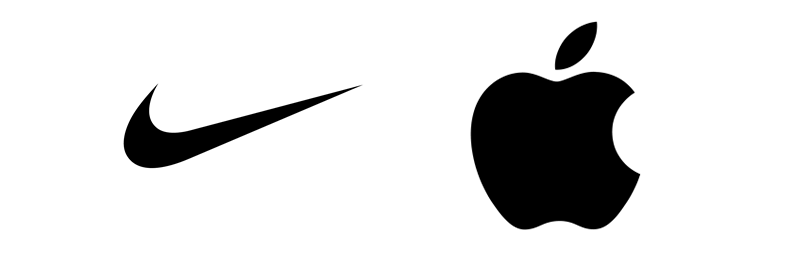
The Nike swoosh and Macintosh apple symbol are great examples of logo design icons and symbols.
If you are focused on building a bigger than life brand with intent to reach the masses, then a simple icon design would be advisable. Simple logo icons and symbols are easier to recognize.
Stay away from complex icons. Actually the term “complex icon” is a blatant oxymoron if there ever was one.
The purpose of a logo icon is present an abstract piece of art that simplifies the more complex overall picture you are deriving it from.
Word mark logo designs
A bit more literal than an icon logo design, a word mark logo design typically spells out the full name of the business or brand. To give this type of logo design some flair, often times a custom font may be created.
I typically advise businesses against using an “off the rack ” font without any customization. This is where you pick and font and spell out the business name without further effort. Really… How original is this type of logo design approach?
At minimum a quality word mark logo design font should be altered so that the font selection itself is not a dead on 100% match of any “off the rack” font choice.
If a custom font is developed to create your word mark logo execution, consider having your creative design agency expand that customized font into a full A to Z alphabet. Nothing says I AM A BIG ASS BRAND TO RECON WITH like that of owning your very own font library.
Custom font library development is a particularly strong branding approach when that custom font is used throughout all of your business branding materials.
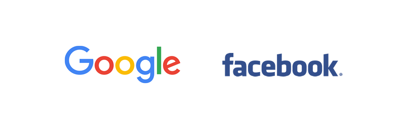
Great examples of word mark logos would be Facebook and Google.
Industry Pro Know: Curious about what font Facebook and Google used to design their word mark logos?
Facebook’s word mark logo is a customization of the font Klavika.
And Google’s most recent word mark logo redesign (released September 1, 2015) is based on the Google Font Product Sans. Again, slight customization was performed to the Product Sans font in order to deliver the new and improved Google word mark logo design.
Letter mark logo designs
Letter mark logos are 100% typographic in nature. This type of logo design showcases a symbol that is typically derived from a combination of letters.
A letter mark logo design is a nice approach for a business whose name is longer or perhaps a bit challenging to pronounce. By combining the initials of the business or the brand’s first letter, you can then develop a graphic visual that will easily illustrate the brand in a quick glance able fashion. (Versus the need to spell out the entire name itself on everything).
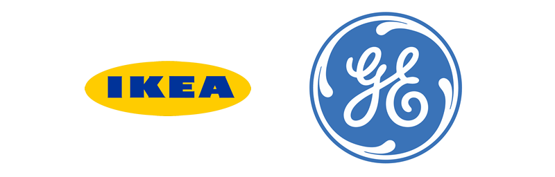
IKEA and GE are two famous letter mark logo design examples.
Industry Pro Know: Have you every wondered what the IKEA or GE letters stand for?
IKEA, is a typographic combination that showcases the first letter of the founder’s first and last name and hometown – which is located in Sweden. (Founder name: Ingvar Kamprad Home town: Elmtaryd Agunnaryd).
GE, is a typographic combination that includes the first letter of the company name, General Electric. The GE logo uses a proprietary typeface GE Inspira.
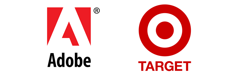
Combination mark logo designs
A combination mark logo is just that. Meaning that it is a combination of a logo icon or symbol and a word mark. Let me get visual for a moment.
LOGO ICON + WORD MARK LOGO = COMBINATION MARK LOGO DESIGN
A well-designed combination mark logo design can be dissected into two parts and the either of those two parts will still look strong enough to carry across a variety of applications.
A combination mark logo has two different, yet solid core components that can stand-alone and look equally as good in separate from and they do when shown together.
TARGET and ADOBE are awesome examples of combination mark logo designs.
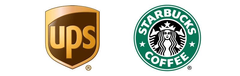
Emblem logo designs
Last but not least let’s explore the logo design world’s more robust entity, an emblem design. An emblem logo design is typically just a way more expanded visual organization of graphic elements. A variety of icons, symbols and words are combined into one larger than life display.
Some will argue that an emblem and a logo design are one in the same. I cannot attest to that statement. If you look up the words “logo” and “emblem” in the dictionary the language pretty much states the same explanation.
Simply think of a logo emblem as a more expanded logo build out. In the history of personal logo design projects an emblem is typically more of a complex composition. It can be particularly challenging to design a logo emblem that translates a variety of undertones and symbols that each have an special meaning – in one simplified execution.
Starbucks and UPS are two great examples of emblem logo designs.
Industry Pro Know: Have you every wondered what the ornate long haired lady that sits inside of the iconic Starbuck’s brand emblem is symbolic of?
Seattle based Starbucks wanted a logo that embodied the seafaring history of its hometown. The female icon you see in the center of their emblem is actually a two-tailed mermaid. The artwork is based on an old 16th-century Norse woodcut. Click here to visit Adweek online to read an interesting article about the history of the Starbuck’s logo.
Still wondering which type of logo design to move forward with?
Take into consideration some of the following:
- What type of products will your logo design be featured on?
- What type of logo design would read best on the types of products you intend to print it on?
- How will your logo design tie into existing branding collateral sales materials?
- How might your logo design be used in advertising mediums? (IE: print ads, apparel, brochures, digital ads, billboards etc.)
- What emotional connection do you want your logo design to evoke?
- What story would you like for your logo design to tell?
A logo design is a complete package that extends well beyond the small creative visual mark it is made of. First impressions are everything in business.
Chances are your logo design will be the first point of visual communication for potential clients to gain a feel of who you are and what your standards are about – make it count by giving us a call today! We’re here to help.
Note about the author: As core founder and Creative Director at TMC, Jami Teer-Murphy leads all branding and marketing strategy efforts. She has a broad multidisciplinary background and over twenty years of advertising industry experience. Though beginning her ad biz journey designing in traditional mediums, Jami embraces all things digital and in a big way. When she’s not creating visual communication eye candy, Jami can be found reading, attending a seminar or blogging about it. She affectionately refers to this behavior as “OCD” (Obsessive Creative Disorder).